“Ray’s sketching, graphic design and calligraphy merged seamlessly with his filmmaking — one discipline quietly fed the other for over a decade before the world ever heard of Pather Panchali.” — IIC Delhi, Ray Between the Covers exhibition text, 2022
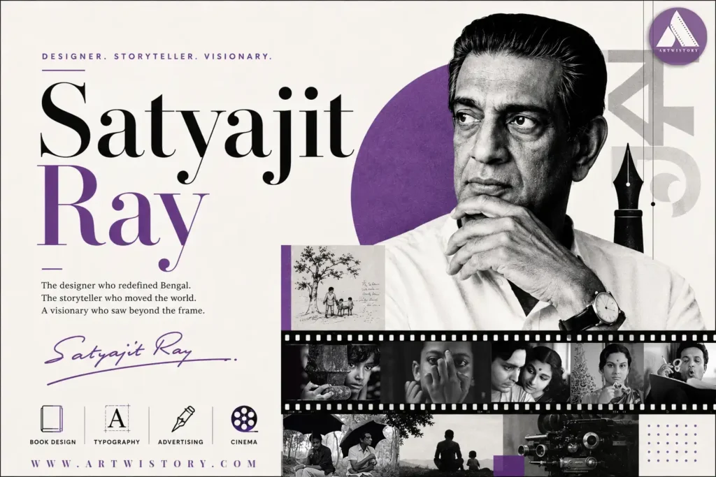
While many of those familiar with Satyajit Ray have heard of the filmmaker who made Pather Panchali (1955) out of thin air, who received an Honorary Oscar, and who changed the trajectory of international cinema, fewer know the designer. Even fewer are aware that the visual style that characterised Ray’s films, including his deliberate use of negative space, composition, and title sequences, did not come naturally. Rather, it was the product of twelve years of designing before he made any films.
This is the story of Satyajit Ray, the graphic designer: the young man who revolutionised Bengali book jackets, who designed advertisements at a British company in Dalhousie Square, who created typefaces, and who – slowly but surely – taught himself cinema through the simple act of reading.
Part Two: A Family Soaked in Ink — The Origins of a Visual Mind
Satyajit Ray was born on 2 May 1921 in Calcutta. Coming from a family that considered visual culture an inheritance rather than a goal, Ray’s grandfather, Upendrakishore Ray Chowdhury, was a distinguished printer and illustrator, having contributed to the development of halftone engraving technology by writing innovative papers in English-language publications in Britain. In addition, his father, Sukumar Ray, was an illustrator, author, and beloved writer of Bengali children’s books, many of which continue to be in circulation. Design was in the blood, as well as in the printing press located on the premises of the family’s house.
Ray matriculated at Presidency College, Calcutta, in the late 1930s to major in economics. However, the turning point came in 1940, when Ray was advised by his mother to enroll in Rabindranath Tagore’s Visva-Bharati University of Santiniketan, specifically in its fine arts faculty, called Kala Bhavana. This move would prove crucial for Ray.
In addition to studying fine arts, Ray acquired a philosophy of seeing at Santiniketan, in which line was privileged to colour, allusion to direct reference, and space to ornamentation.
Through his association with the renowned artist Nandalal Bose, who belonged to the Bengal school of art, which was established by Abanindranath Tagore, he was introduced to the techniques of miniature paintings of India, Mughal drawing styles, brushwork of Japan, and Chinese calligraphy. Through another great Bengali artist named Benode Behari Mukherjee, he came across a modernistic style of art where Western compositional techniques were amalgamated with Indian aesthetics.
He never graduated from the institute, returning to Calcutta due to the financial conditions of his mother. However, the training proved to be extremely effective as he came back with the skills of a draughtsman, a calligrapher’s approach to creating art, and the rare gift of imagining an entire composition in his mind even before executing any of it on paper. This talent of his became quite famous years later when he became one of the most efficient storyboard artists in the history of world cinema.
Part Three: D.J. Keymer — Learning to Sell, Learning to See
In 1943, Satyajit Ray started work with D.J. Keymer & Co., a British-owned advertising firm on Dalhousie Square, which would later be known as Ogilvy & Mather. At twenty-two years old, penniless and highly skeptical about the nature of advertising as a profession, he stayed there for seven years.
Ray’s mentor was the art director of Keymer, Annada Munshi, a figure who appears rarely in any film historiography of Ray, yet needs to be acknowledged significantly. From Annada Munshi, Ray learnt those commercial arts which were deliberately neglected at Santiniketan: type-setting, printing, layout and grid structures, and above all, the tough task of conveying one single thought within the confines of a fixed rectangle – a new education in practice and precision.
It is what distinguished Ray’s work at Keymer from the rest. While other commercial artists followed elaborate Victorian aesthetics or borrowed the generic forms of Western Modernism, Ray brought with himself the folk elements of Bengal into his designs, along with the line art and calligraphy learned from Santiniketan. For instance, his layout designs showed his characteristic approach towards negative spaces – blank spaces which drew attention by design rather than filling up each available gap with text and graphics.
This particular ad page helped Ray understand that cinema, later on, would reinforce the notion that what you do not show is equally significant as what you show.
In 1950, Satyajit Ray found himself dispatched by Keymer to their London offices on what was a standard assignment and turned out to be the most cinematographically important business trip ever taken in Indian culture history. During a period of three months, Ray watched more than ninety movies, ranging from Jean Renoir’s movie The River that Renoir filmed in Bengal last year to, most importantly, De Sica’s Bicycle Thieves. This was particularly true of the latter as, with its unprofessional actors, its location-based filming process, and subtle humanism, it confirmed to Ray once and for all that he had to make this movie, an adaptation of a Bengali novel written by Bibhutibhushan Bandopadhyay.
Part Four: Signet Press — Where a Graphic Designer Rewrote Bengali Book Culture
At the same time that Satyajit Ray was working as an employee at Keymer, however, Ray was engaged in what would prove to be some of his finest and possibly most important works of his career in Bengali visual culture aside from cinema. It was in 1943 when the owner of Signet Press, D.K. Gupta, approached him to design covers for the newly formed press.
In doing so, Ray provided him with what can only be described as a gift – total creative license. This would allow Ray to create designs of a caliber not previously witnessed within the field of Bengali literature. Up until Signet Press, Bengali books consisted of typical design conventions, including traditional decorative type, literal illustrations depicting plot, and subservient design to content.
The Covers That Changed Bengali Design
Let us take the case of the cover designed for Jibanananda Das’ book of poems Banalata Sen (1944), where while a usual designer may have resorted to portraiture or a rural scene, Satyajit Ray created an abstract cover, using stylized lines borrowed from Indian art forms combined with careful asymmetry, which he had picked up from Santiniketan.
The way he dealt with Chander Pahar, an adventure story by Bibhutibhushan, revealed his other creative side — the bold use of images combined with contrasting colors. Similarly, the design for Aam Antir Bhepu, a children’s version of the same book that Satyajit Ray adapted into Pather Panchali, displayed his versatility and ability to go completely out of his zone to design something that was appealing to children without being patronizing.
Selected Signet Press covers by Ray:
- Banalata Sen — Jibanananda Das, 1944 (Poetry)
- Chander Pahar — Bibhutibhushan, c. 1944 (Adventure)
- Aam Antir Bhepu — Children’s abridgement of Pather Panchali
- Discovery of India — Jawaharlal Nehru (English edition)
- Rupasi Bangla — Jibanananda Das (Poetry)
When Ray started filmmaking, he had created what scholars have estimated to be around 5,500 designs for books, magazines, advertisements, and other media. It was the IIC Delhi’s groundbreaking exhibition, “Ray Between the Covers,” in 2022, which proved that Ray was not only instrumental in shaping the world of Bengali book design but also in revolutionizing it.
Part Five: The Typographer — Ray Roman and the Art of the Letterform
Perhaps among the least explored facets of Ray’s pre-filmography was his typographic work. Typographic art—the art of designing the architecture of written language—engaged his attention during his period as a designer, and his innovative forays into this realm led to his creation of a font whose enduring fame cannot be gainsaid.
Ray Roman, the Latin script typeface he created, received international recognition, winning an award in a contest arranged by the International Typeface Corporation, where it competed against typefaces submitted by professional typographers from all over Europe and North America. That this non-professional designer based out of Calcutta, whose primary concern lay in Bengali visual culture, could craft a Latin typeface good enough to win a contest suggests much about Ray’s skill and dedication to the architectural language of the word.
He has created several typefaces for Bengali and some script types during his career as well, which he used in his film titles and credits. The use of hand-drawn letters in the beginning titles of Ray’s films was not something superficial. Rather, it was just an extension of his long-standing expertise in lettering work.
Part Six: From the Drawing Board to the Frame — Design Thinking in Ray’s Cinema
Not whether Ray’s design education has affected his films – of course it did. The question is how and in what detail.
First, there is the most immediate legacy of storyboarding. Ray storyboarded extensively and unusually, drawing each shot in advance of shooting it. The ability to imagine a composition in the mind’s eye and represent it clearly on paper is precisely the ability that design training fosters above all else. The storyboards for Pather Panchali reflect a vocabulary of images Ray has been working with since Santiniketan.
Second, there is the more subtle legacy of negative space in framing. The Apu trilogy is notable for what it leaves out – shots where the power of the moment is expressed not by characters’ faces but by the absence of characters, by space, by silence. It is the aesthetic of a designer who learned through a decade of experience that the negative space on a page was more important than the positive space.
The very eye which put type into proper order on Signet Press’s books now did the same with light and shadows in the Bengal’s paddy fields. The same grammar applied; the only difference was in medium.
Ray also made his own poster designs for his movies, kept illustrating all through his film making years, and made title designs for his movies with as much regard for letter forms as he had always paid in typography. He was, by all means, a total designer, someone who blurred boundaries between commercial art and fine art and between graphic design and film so much as to make them irrelevant.
Why the Design Years Matter Now
In film culture there is an attitude where the life stories of important filmmakers prior to making their movies are seen as prologues, a time that must be endured before arriving at the good stuff. In the case of Ray, this attitude does particular damage. The period when he was working as a graphic designer is not prologue; it is foundation.
To see Ray as a practitioner of design, a person who has dedicated twelve years of his life to building a vocabulary visually through design, calligraphy, typography, and the discipline of designing book covers, makes one appreciate his movies in a different light. Suddenly compositions seem less intuitive and more well-deserved; silences seem less poetic and more thoughtful; title sequences seem less happenstance and more like the result of twelve years thinking about letters.
In presenting Ray Between the Covers, featuring the work of Ray as an artist of the book jacket cover design in its own right at the IIC Delhi in 2022, a claim is being made that film historians have been rather reluctant to embrace: Satyajit Ray’s greatest masterpiece did not lie in a film or a body of films but in a life spent in using film as just one of many mediums for artistic expression.
That is what makes him a graphic designer who made films. The importance of that statement cannot be understated.